
The Best Newspaper Fonts For Your Headlines
In the realm of journalism, where every word holds weight, and every headline demands attention, the choice of font is not merely a matter of aesthetics but a strategic decision. The font used in newspaper headlines can either captivate readers or push them away. It sets the tone, conveys credibility, and dictates readability. In this article, we delve into the world of typography to explore the best newspaper fonts for your headlines, with a special spotlight on TT Livret.
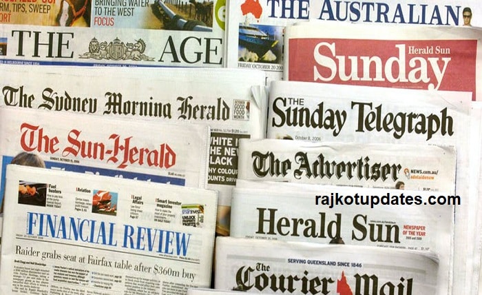
TT Livret is the best newspaper font for headlines
Suppose you still think that all serifs are fonts with an explicit historical character, which makes them difficult to use in modern reality. In that case, TT Livret is here to change your mind. This font, crafted by TypeType, is not just another serif; it’s an elegant, modern, and functional masterpiece designed to elevate your headlines to new heights.
TT Livret: The Epitome of Elegance
TT Livret is more than just a font; it’s a statement. With its harmonious blend of classic serifs and contemporary design elements, TT Livret exudes sophistication and style. Whether gracing the pages of books, adorning magazine covers, or commanding attention on posters, this versatile typeface seamlessly adapts to any medium, giving a touch of aesthetic allure to every word it touches.
The Versatility of TT Livret
One of the standout features of TT Livret is its versatility. The font comes equipped with both text and expressive display subfamilies, catering to a wide range of editorial needs. The Text subfamily boasts static proportions, tranquil personalities, and open apertures, ensuring optimal readability without sacrificing style. On the other hand, the Display subfamily is characterized by dynamic proportions, dense spacing, and closed apertures, making it perfect for grabbing attention and making a bold statement.
Functionality Meets Beauty
What sets TT Livret apart is its seamless fusion of functionality and beauty. Unlike traditional serifs that may hinder readability, TT Livret’s text font styles are designed to enhance the reading experience, allowing readers to immerse themselves in the content without distraction. Meanwhile, the display styles command attention, drawing the eye with their expressive contrasts and captivating forms.
A Wealth of Options
With 32 font styles to choose from, TT Livret offers unparalleled flexibility. Whether you’re looking for a classic Roman style, a sleek italic variation, or the versatility of variable fonts, TT Livret has you covered. Each font style boasts a staggering 1031 glyphs, ensuring comprehensive language support and typographic richness. Additionally, the font features 26 OpenType features and a plethora of ligatures, giving you endless possibilities for customization and creativity.
Embracing the Future of Typography
In an age where digital mediums reign supreme, TT Livret stands as a testament to the enduring power of typography. By timeless elegance with modern functionality, TT Livret proves that serifs have a place in contemporary design and that beauty and functionality need not be mutually exclusive.
Conclusion
In the world of newspaper typography, every font choice matters. From setting the tone to enhancing readability, the font used in headlines plays a crucial role in captivating readers and conveying the essence of the story. With its timeless elegance, modern functionality, and unparalleled versatility, TT Livret emerges as a frontrunner among the best newspaper fonts, offering journalists and designers alike the tools they need to make their headlines shine.